[
Content
Nativebase Design System
Design system is a set of standards to manage design at scale by reducing redundancy while creating a shared library and visual consistency across different pages and platforms.

Role
UI/UX Designer
Deliverables
Design library
Component guideline
Tools
Figma
Year
2021-22
Challenge
As our product teams grew, we started running into the same problems again and again
Inconsistent designs across Android, iOS, and Web
Developers were building the same components multiple times
Designers used different styles, making the UI feel unpolished and disconnected
A lot of time was wasted fixing spacing, colors, and layouts during handoff
Accessibility was often overlooked, leading to usability issues for some users
There was no shared system or visual language each team was working in their own way. This caused confusion, delays, and a lack of consistency across projects.
We needed a single source of truth that everyone designers and developers could follow to create products faster, with more consistency and better quality.
Problem Statement
Designers and developers were creating the same things like buttons, forms, and pop-ups from scratch for every project. This caused the apps to look and behave differently, took more time to build, and made the user experience feel disjointed. There was no single guide everyone could follow for things like spacing, fonts, or accessibility.
Research & Discovery
Tools Used - Stake Holders Interview, Survey ,Audit
Competative Research - Analyzed popular design systems like Google’s Material Design, IBM’s Carbon, and Tailwind CSS
We audited 8 ongoing projects and interviewed 5 frontend developers. 78% reported wasted time recreating base components. We also benchmarked Google’s Material to define foundational layers
Key Findings - Interview
Lack of component standardisation led to ~40% design debt
Duplicate efforts were seen across 3 separate mobile teams
“Developers are recreating buttons and modals almost every sprint.”
Key Findings - Internal Survey
81% wanted a shared, centralized component library
73% felt unsure about the alignment between dev and design
60% cited communication gaps between designers and engineers
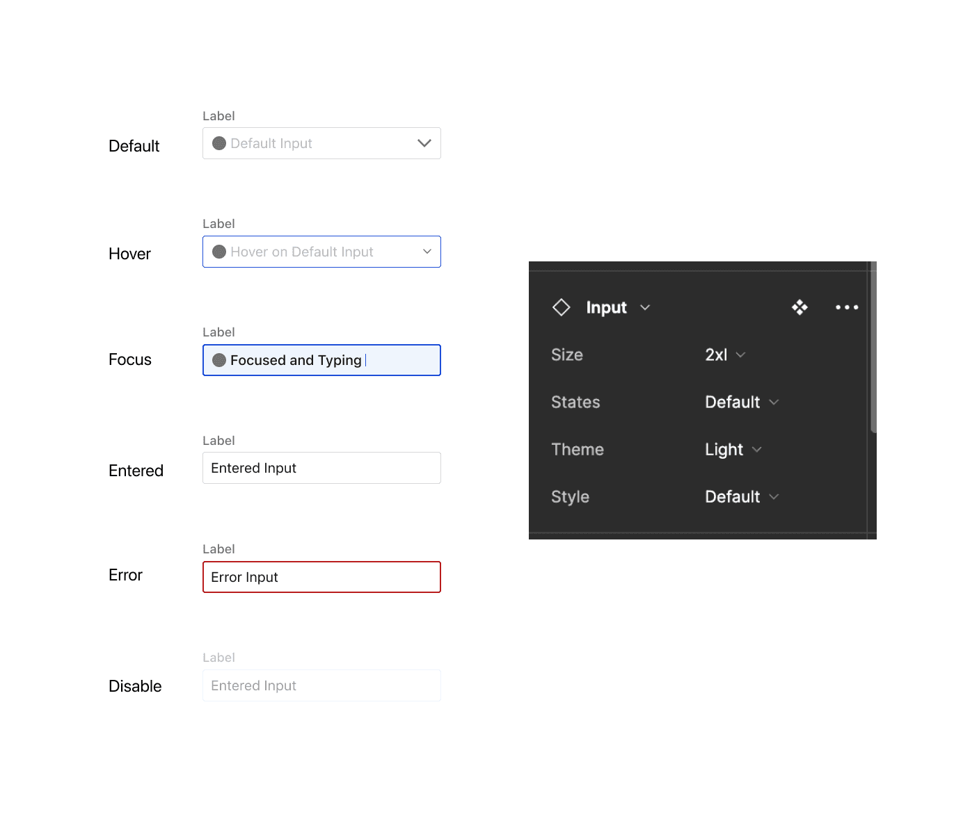
We created everything in Figma, using shared design (like standard colors and spacing), so designers could work faster and with fewer errors. Every component had defined states like default, hover, disabled, and loading, making it easy to design for real-world usage.
We also designed with developers in mind—making sure that what we created in Figma could be easily translated into code, reducing back-and-forth during handoff.
Competative Analysis
We analysed leading design systems including Google Material Design,Tailwind CSS and IBM Carbon.
Google Material Design: Comprehensive components and strong accessibility but limited React Native support.
Tailwind CSS: Utility-first approach enabling fast styling but lacks pre-built React Native components.
IBM Carbon: Enterprise-grade with excellent accessibility and documentation but complex for smaller teams.
Our Opportunity:
NativeBase combines the best of these by offering a cross-platform, accessible, and developer-friendly system optimized for React Native and Web.
Define
Our goal was simple: build a design system that made life easier for both designers and developers. We wanted something that looked consistent, worked across both web and mobile, and followed accessibility best practices.
To do this, we broke everything down into clear layers:
Basics like colors, text styles, and spacing formed the foundation.
Reusable pieces like buttons and input fields were built on top of that.
Larger patterns like cards and pop-ups came next.
We planned the work in small, manageable phases, starting with the most-used parts first. To keep everyone on the same page, we used tools like Figma and set up a collaboration framework, making it easy for designers and developers to work together smoothly.
This clear, organized approach helped us create a design system that was not only easy to use but also saved time, reduced confusion, and ensured everything looked and behaved consistently—whether it was on a phone or a laptop.
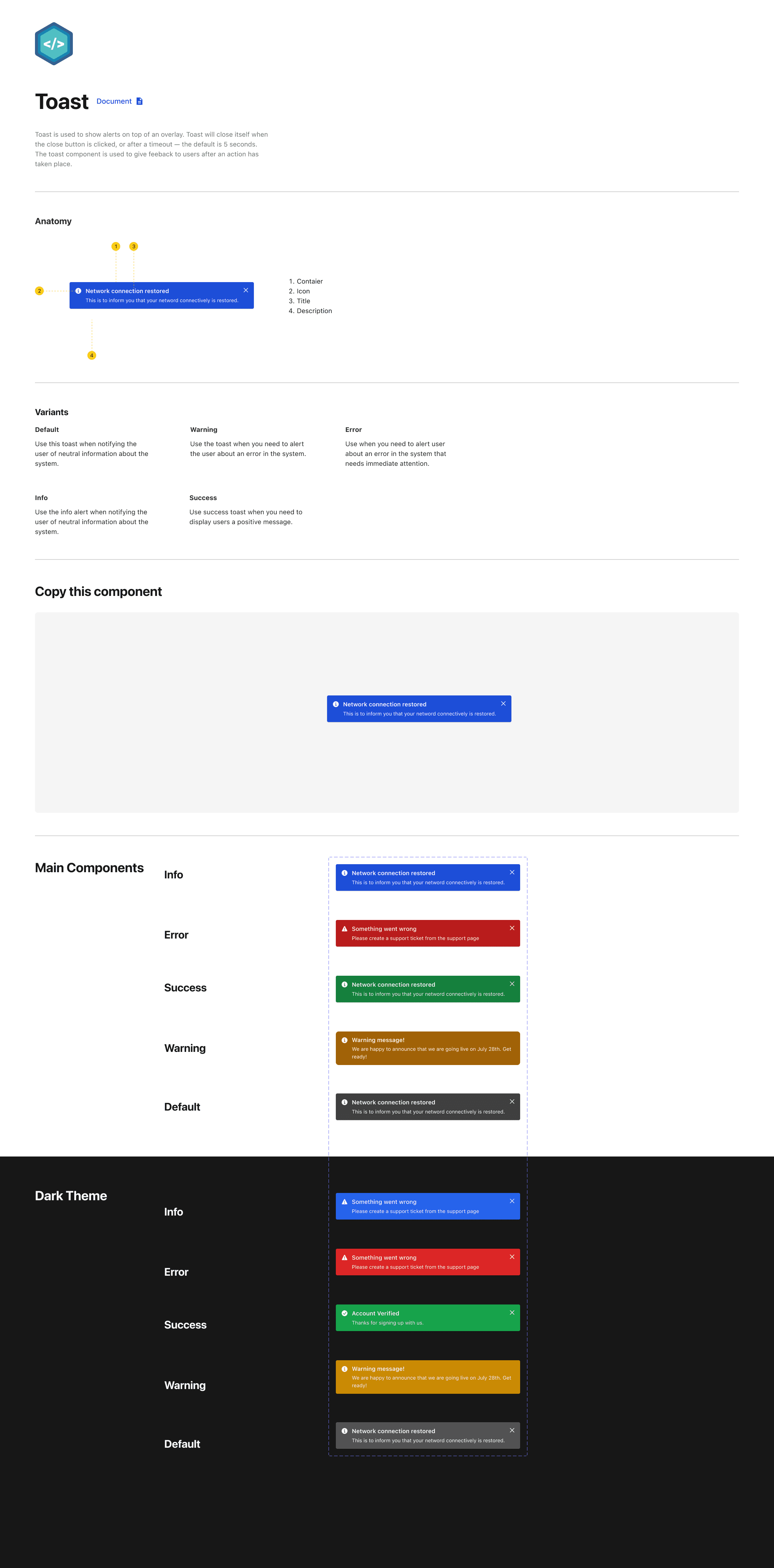
The component library consists of
Component Name
A specific and unique UI component name, to avoid miscommunication between designers and developers. This needed to be clear so that the components would work as they were supposed to without error.
Note making
Page annotations and descriptions to understand what component you were looking at.
State changes
Recommended defaults and the subsequent changes in appearance.
Breakpoints
Any size indication and breakpoints for the developers.


Execution
Started with a good foundation so everything stays in place. This foundation includes spacing, layout, and grids in design. These small details help the design feel clean, neat, and easy to use.
I followed a simple rule for this project: use 8-pixel steps for spacing. That means all the gaps and padding were evenly sized. I also used a 12-column layout, which helped everything line up nicely on screens of all sizes—phones, tablets, or laptops.
This setup made a big difference:
It kept the design consistent across Android, iOS, and Web
It made screens look good on any device
It helped create a smooth and polished user experience
40% faster design-to-development handoff - reusable components helped teams spent less time on back-and-forth and more time building.
65% component reuse rate across projects -Most screens were built using system components, reducing the need to custom-build UI from scratch.
60% drop in design inconsistencies - Fewer visual mismatches and alignment issues across platforms like Android, iOS, and Web.
30% improvement in designer–developer collaboration - Shared Figma libraries and documentation helped teams work better together and reduced confusion.
Adopted by 15+ projects within the first 3 months - Fast internal adoption showed how useful and scalable the system was.
Outcomes
Each component included clearly defined variants, each appropriately named to ensure clarity. This approach made it straightforward to understand state changes and customize components by toggling specific features on or off, streamlining the publishing process and ensuring ease of use.


Overview
NativeBase Design System was created to help designers and developers build apps faster and more consistently across Android, iOS, and the Web. It provides ready-made, easy-to-use components that look and work the same everywhere.
By using this system, teams can save time, avoid mistakes, and create products that are accessible and polished. It’s not just a set of tools — it’s a shared language that brings everyone together to build better apps, faster.

Documentation
Documentation is always included on the same page as the component this was to explain any use cases that were created. This consisted of:
A clear explanation for what this element is and how it is typically used, occasionally accompanied by dos and don’ts for context and clarification.
Picture examples so that it was clear what we were talking about
Rules of when to use the component and how to use the component
The style guide consisted of:
In-page annotations (how we document and layout each component within the library)
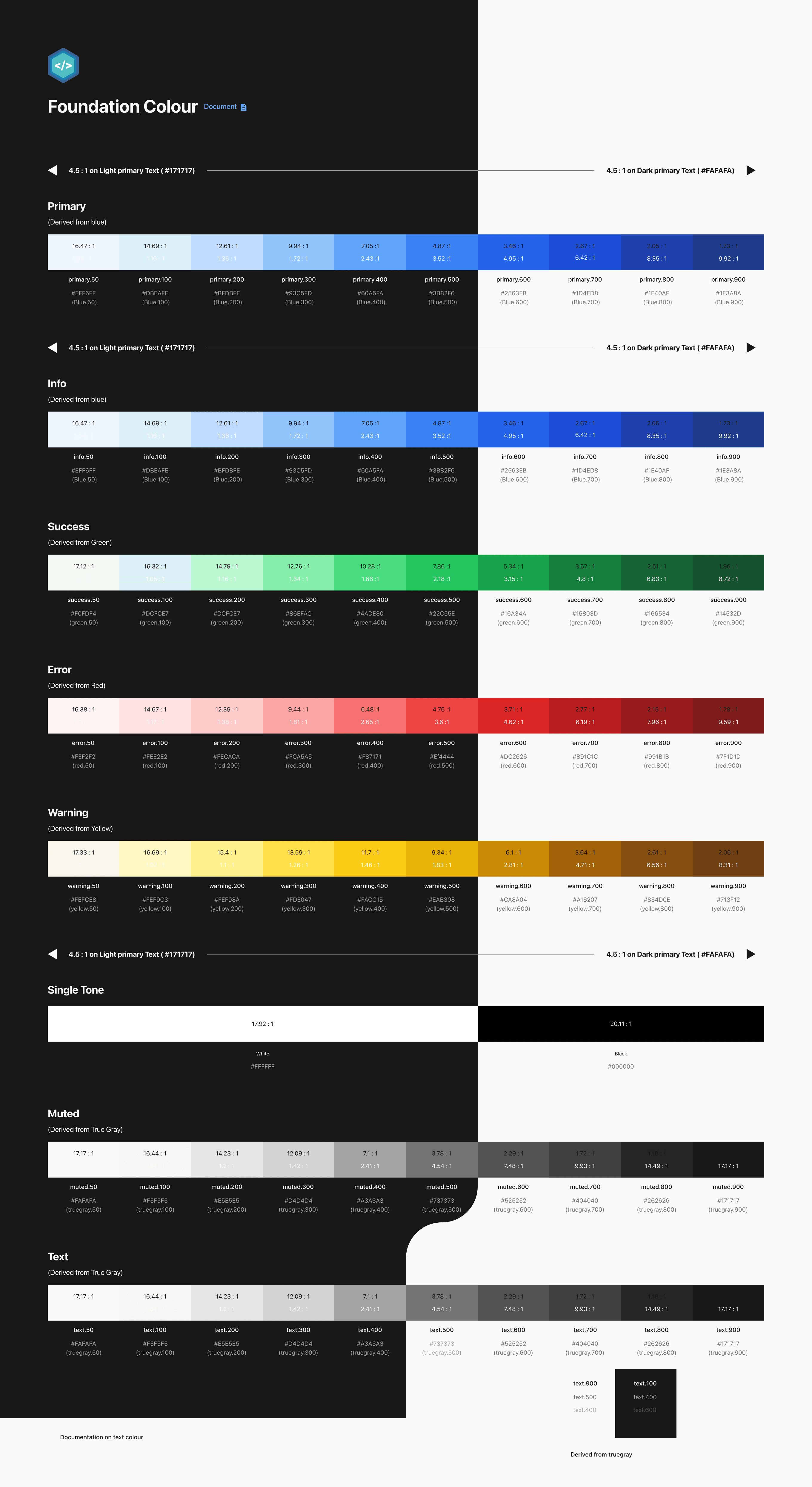
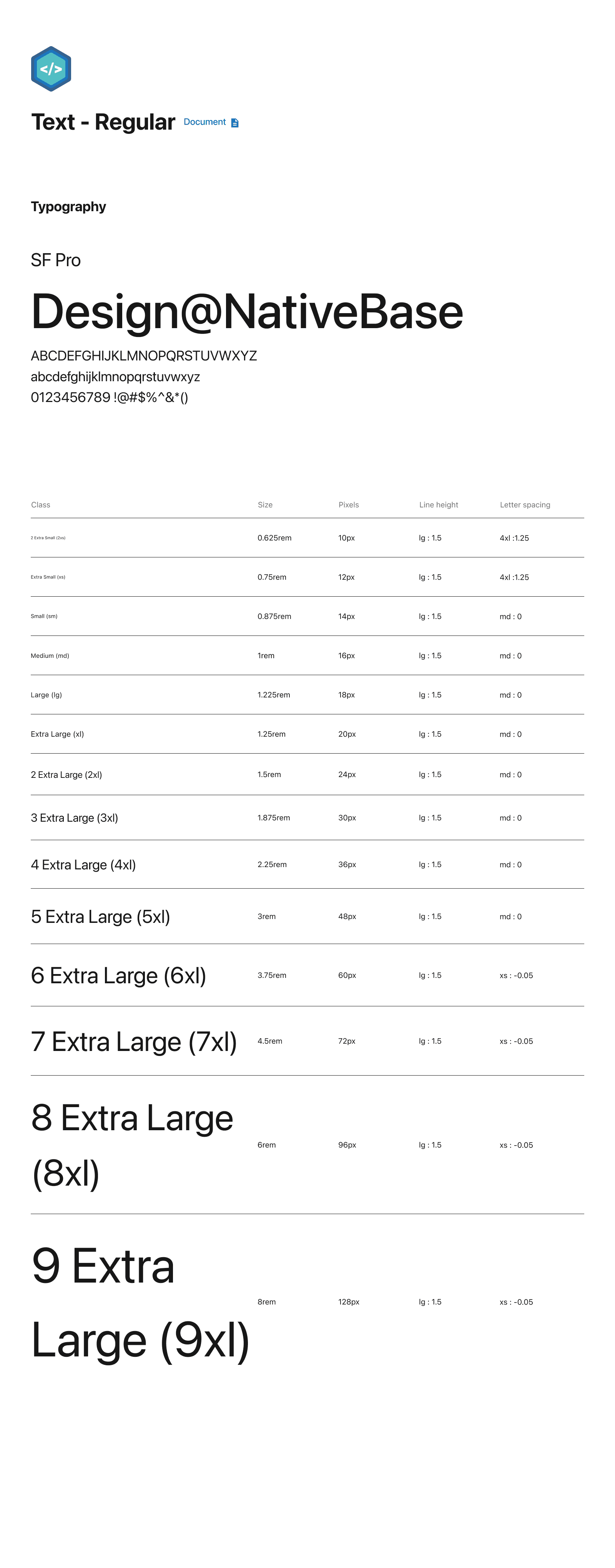
Branding (colours, typography)
Spacing guidelines
Layout grids
Icon pack
Border radius guidelines
Creating all components library