
Email Module
Gesture Guide / Sample Screens
The IAM Super App combines a wide array of services, integrating Carrefour, Vox Cinemas, Uber, AirAsia, parking assistance, and more into a single, comprehensive platform. This super app aims to provide a seamless and integrated experience across multiple aspects of daily life.
Overview
Role
Product Stratergy
6 Months
Mobile
Scrum Team
Product Manager
Product Owner
Figma
Miro
Paper Prototypes
Usability Metric
Experience Designer
Product and UI /UX
UI Testing
Platform
Teams
Duration
Tools
The IAMPLUS app, intended to integrate a wide array of services such as retail (Carrefour), entertainment (Vox Cinemas), ride-hailing (Uber), travel (AirAsia), and parking assistance, faced significant usability and functionality challenges during its pre-development phase. The initial controls and features were incomplete and problematic, leading to a suboptimal user experience. There was a critical need for a dedicated UI/UX designer to identify and address these issues, improve the overall user experience, and ensure a seamless integration of all services. This required a comprehensive understanding of the existing UX flaws and the implementation of effective solutions to enhance the app’s usability and functionality before its broader release.
The Problem Statement
I joined the IAMPLUS project during the development phase, collaborating closely with the client as a designer. The initial scope was focused solely on the pre- release. My role involved understanding UX issues and enhancing the product experience over time. I took ownership of the most important features throughout the IAMPLUS app's development timeline. When I first worked on the timeline in January 2021, I encountered problematic controls and incomplete features. I addressed these issues by fixing the workflows, resolving UX flaws, and tackling usability problems.
This scenario presented a unique opportunity to make a substantial impact on the IAMPLUS app's success. By stepping in as the UI/UX designer and collaborating closely with the client and Dev team , I had the chance to:
Identify and resolve critical UX issues, streamline workflows, and improve the overall usability of the app.
Taking ownership of the most important features and controls across the development timeline, ensuring they met high usability standards.
Work on integrating various services smoothly into the app, creating a cohesive and efficient user experience.
Lay the groundwork for future development stages by addressing the foundational flaws in the pre-beta phase, setting the app up for success in subsequent releases.
Opportunity
On Boarding Flow / Sample Screens


News Module/ Sample Screens
Hotel Booking Module/ Sample Screens
Weather Module/ Sample Screens
Uber/ Sample Screens
Email Module/ Sample Screens

Highlights
Challenges
Incomplete features, high user expectations
Identified key problems: confusing navigation, poor service integration, and inadequate onboarding experience.
Reduced the Number of clicks
The previous flow had a lot of clicks and I was worried that will frustrate the user and they will stop using the Applications.
Resolved Critical UX issues
Addressed incomplete features and navigational inconsistencies to enhance overall usability significantly.
Iterative Testing and Feedback Loops
Addressed incomplete features and navigational inconsistencies to enhance overall usability significantly.
Usability Testing
Positive response, suggestions for minor adjustments, and further refinements.
Redesigned onboarding processes to make them intuitive, informative, and engaging, reducing user drop-off rates during initial app interactions.
After releasing the product to a few customers we gathered these interesting data considering the development constraints.
Results
70+
Users in 2 weeks
25%
Quicker Issue Resolved
140+
Unique Users
Regular iterations & suggestions for minor adjustments, and further refinements.
Simplified navigation, reduced confusion, and improved accessibility.
Higher engagement and retention rates post-launch.


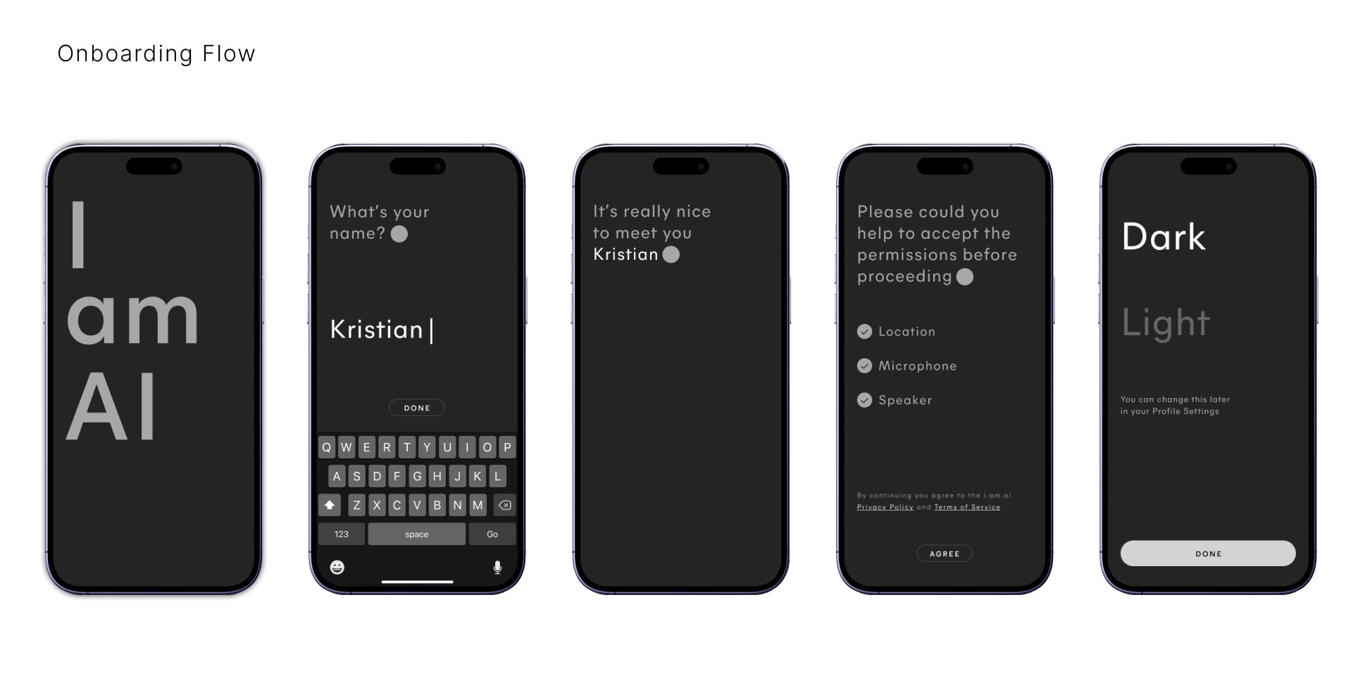
The IAMPLUS app's onboarding process, users faced several critical issues that impeded their ability to fully understand and engage with the app. The onboarding screens were overloaded with information, presented in a confusing and overwhelming manner, causing users to struggle with comprehending the app's value and features. Navigation through the onboarding process was not intuitive, leading to frustration and abandonment.the lack of personalization made the onboarding experience feel generic and irrelevant to individual users' needs. These issues collectively led to a poor first impression, decreased user satisfaction, and lower engagement
The Problem Statement
User onboarding is really important in today’s competitive digital world, where many apps and platforms compete for attention. It’s the first impression users get of your product, showing them how it works and why it’s valuable. A good onboarding experience can decide whether users stick around and keep using your platform, affecting retention, engagement, and overall success.
The initial moments a user spends interacting with IAM PLUS are critical for establishing a positive first impression. During the onboarding experience, clear instructions and concise explanations are paramount to ensuring users grasp the app’s value proposition and core functionalities effectively.
Creating a great onboarding experience for IAMPLUS starts with understanding our users. Personas help us do this. They are made-up characters that represent different types of users who will use our app. These personas show us what our users are like, what they need, and what they want to achieve, helping us design a better user experience.
User customization in the IAMPLUS onboarding experience include:
Visual Themes: Users can personalize the interface by Implemented a theme picker during onboarding
Functionality Preferences: Included an easy-to-navigate settings menu within the onboarding flow, with tooltips and explanations to help users understand the impact of each setting.
Workspace Organization: Introduced a customizable dashboard setup during onboarding, where users can drag and drop widgets to create a personalized layout that suits their workflow..
Crafting Compelling User Onboarding Experiences
A. Clarity and Conciseness:
B. Understanding Your Users Through Personas:
C. Empowering Our Users Through Customization:
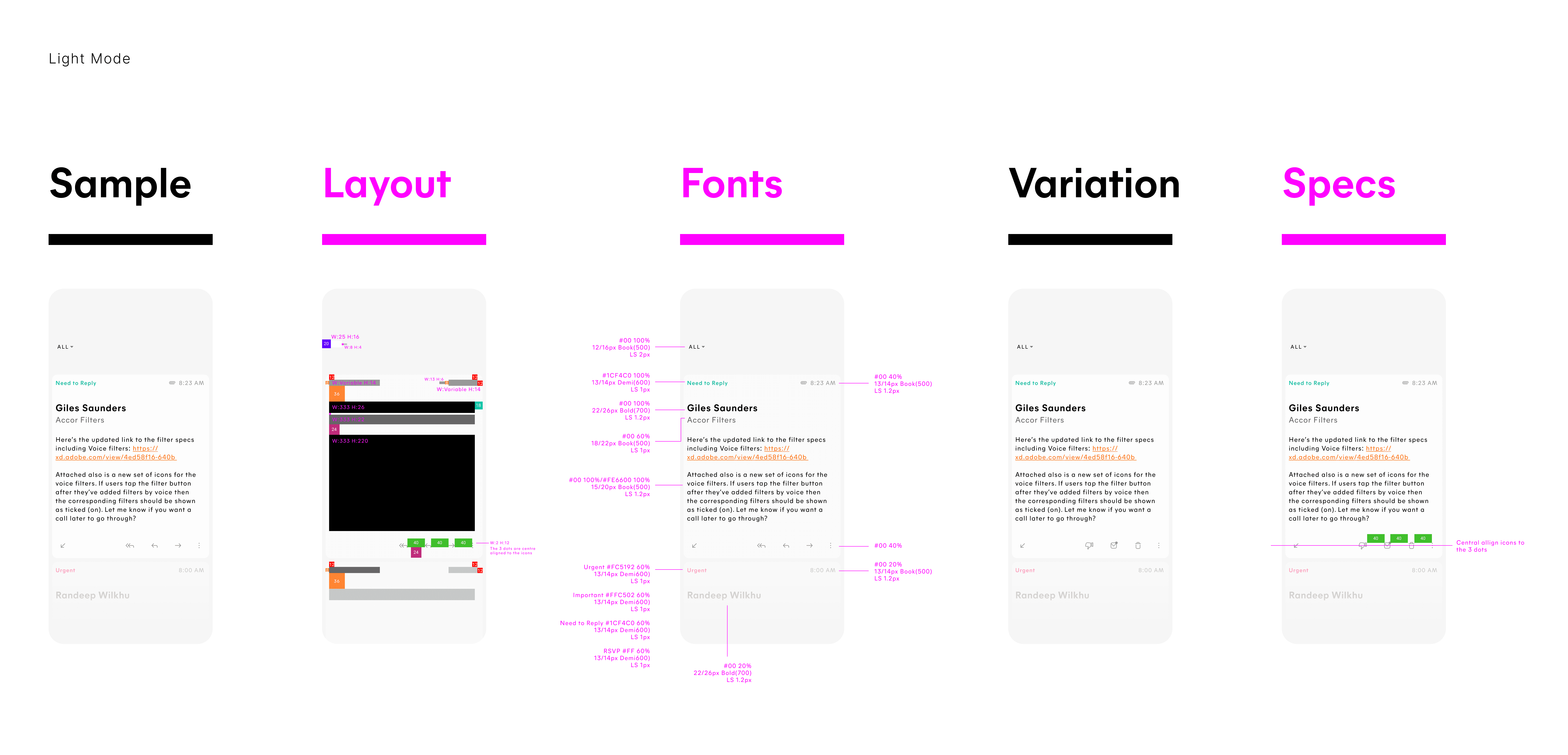
The News module of the IAMPLUS app, designed to offer users a personalized and comprehensive news experience, the interface is cluttered and unintuitive, making it difficult for users to navigate and find the information they seek. The lack of efficient content filtering and categorization further exacerbates these issues, resulting in a suboptimal user experience.These problems collectively hinder the News module's ability to deliver timely, relevant, and engaging news content and redesign to meet user needs effectively.
The Problem Statement
1.Provide a brief overview of the app’s capabilities.
2.Showcase the primary services (Carrefour, Vox Cinemas, Uber, AirAsia, parking assistance) and how they benefit the user.
3.Emphasize the unique advantages of using IAMPLUS, such as personalized recommendations, exclusive offers, and seamless integration.
4.Obtain necessary permissions for location, notifications, and other app functionalities.
5.Facilitate easy and quick user registration or login to personalize the app experience.
The Solution
Integrating gesture-based interactions
Gesture Tutorial: As part of the initial onboarding process, I have introduce an interactive overlay that guides users through essential gestures. This overlay can dim the background and highlight the specific areas where gestures can be performed.
Step-by-Step Instructions: Providing clear, step-by-step instructions for each gesture, including swipe, pinch, double-tap, and long-press actions. Use animations to demonstrate the gestures in real-time.
Practice Mode: Users to practice gestures in a safe, non-intrusive environment during onboarding, with immediate feedback on their actions.
Contextual Tooltips: Using tooltips that appear the first time a user navigates to a new section of the app, reminding them of relevant gestures. These tooltips can fade out after the user performs the gesture or after a few seconds.
Persistent Help Icon: Included a help icon that users can tap at any time to revisit the gesture guide. This should be accessible from the main dashboard and key functional areas of the app.
Objective
To ensure users are aware of and comfortable using the app’s gesture-based navigation, enhancing their overall experience and efficiency within the IAMPLUS app.

The booking interface is cluttered and unintuitive, complicating navigation and making the booking process cumbersome and frustrating. Additionally, real-time availability and pricing updates frequently fail, leading to discrepancies that further frustrate users.Users often struggle with the search functionality, which returns irrelevant or inconsistent results, making it difficult to find suitable accommodations.
The Problem Statement
Users find the interface cluttered and unintuitive, making it difficult to quickly access essential weather information. The design lacks visual appeal and fails to effectively communicate key data such as temperature, forecasts, and severe weather alerts.UI challenges result in a frustrating user experience, leading to decreased usage and overall dissatisfaction.Redesign is necessary to create a more user-friendly, visually appealing, and efficient interface that enhances the overall user experience and meets the needs of our diverse user base.
The Problem Statement
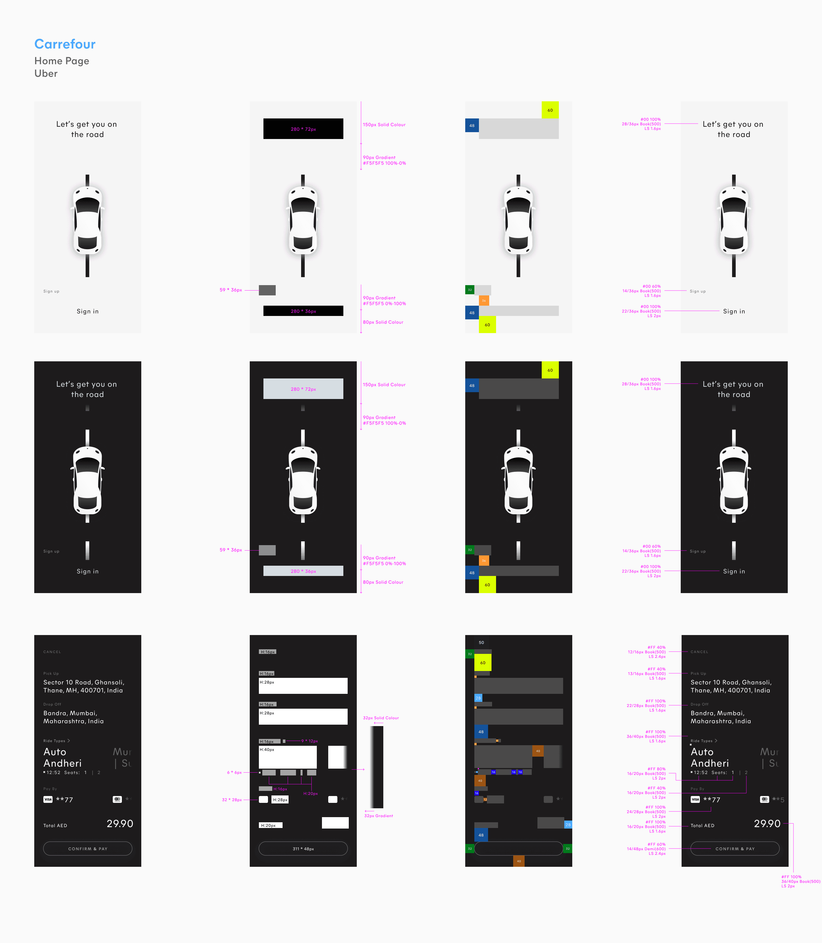
The current cab booking feature of the IAMPLUS app, which utilizes the Uber API.A comprehensive redesign of the UI and improved integration with the Uber API are essential to address these issues and provide a smooth, efficient, and user-friendly booking experience.
The Problem Statement
1.Upgrading the search algorithm to provide more accurate and relevant results based on user preferences, filters, and past behavior.
2.Introducing comprehensive filters (e.g., price range, amenities, location, ratings) and sorting options (e.g., price, distance, popularity).
3.Redesign the booking interface with a clean, minimalist layout, intuitive navigation, and clear call-to-action buttons..
4. Integrate detailed user reviews and ratings into the search results and booking pages.
5. Clearly display cancellation and modification policies during the booking process.
The Solution
1.Use modern, high-quality visuals and icons to represent weather conditions and data.
2.Implement dynamic backgrounds that change based on the current weather and time of day.
3.Present weather data in a clear and concise manner with large, easy-to-read fonts and simple graphics.
4.Offer customizable widgets for the home screen, allowing users to choose the type of weather information displayed.
5.Ensure severe weather alerts and notifications are timely, relevant, and prominently displayed.
The Solution

Food Ordering Module/ Sample Screens


Content
IAMPLUS - Super App
IAMPLUS, in collaboration with Carrefour, aims to enhance the shopping experience by leveraging the capabilities of a super app. Carrefour, a global retail giant, has partnered with IAMPLUS to integrate its retail services into the super app, providing users with a seamless and comprehensive shopping experience.


1.Utilize machine learning algorithms to analyze user behavior, preferences, and reading history.
2.Allowing users to customize their news feed by selecting topics, sources, and regions of interest during onboarding and within settings..
3.Redesigned the interface with a clean, minimalist layout, clear categories, and easy-to-use navigation.
4.Adding feedback options for users to rate the relevance and quality of news articles.
The Solution