
Content
Meta - Data Visualisation & Storytelling Guide
With user-centered approach, the goals was to create an intuitive interface for effortless and incorporating gamification.
Low hanging fruit Standardization of templates and Reducing cognitive load Expanding on brand colors Using color intentionally and purposefully in charts Focus on content instead of # of slides Telling a clear story Actionable insights


Detailed Document Link
Detailed Document Link
Professionals often struggle to effectively integrate data into compelling narratives due to a lack of practical guidance. Existing resources are either too technical or superficial, leaving users without the tools they need to create impactful presentations. There is a need for user-centered resources that combine storytelling principles with data visualization best practices, empowering users to communicate insights more effectively.
The Problem Statement
Designing the meta slides and creating the storytelling guide and data visualization guide was rooted in a user-centered design methodology. I engaged in a comprehensive process that involved collaboration with stakeholders and fellow designers, as well as extensive user research, to ensure the final product effectively addressed the needs and challenges of our audience. The storytelling guide was developed to explain the storytelling framework and guide users on how to effectively incorporate data into narratives. The data visualization guide provided detailed insights into color theory, typography principles, and best practices for various chart types.
Solution
During a recent call with client stakeholders, it became clear that they were overwhelmed by the sheer volume of data and stories they wanted to share. Their enthusiasm led them to try to include all the data and narratives in their presentations, resulting in overly lengthy slides and complex visualizations. The decks were cluttered, making it difficult for viewers to grasp the key insights quickly. The structure was inconsistent, with repeated information but no clear focus, and the project team was unsure whether they were using the appropriate visualizations for their data.
This lack of clarity and organization made their story difficult to tell and ultimately diluted the impact of their message. Recognizing this, we aimed to help them streamline their content, focus on the most important data, and select the right visualizations to make their story more compelling and easier to understand.
Stateholder Interview
We had an opportunity to help the client enhance their presentation by focusing on reducing cognitive load—how much information the audience needs to process on each slide. The client had a wealth of data and stories they were eager to share, but presenting everything at once overwhelmed their viewers and diluted the impact of their message. To address this, we guided them in refining their narrative, helping them prioritize the most important data and stories that aligned with their goals. We also introduced design standards, including a cohesive color palette that extended beyond just greys, to create a more visually engaging and unified presentation.
Additionally, we emphasized the importance of highlighting key insights so that the most critical information stood out clearly. Through these strategies, we aimed to help the client tell a more concise and impactful story with their data, making their presentations not only clearer but also more compelling for their audience.
Building Solutions
Understanding the Current Process
How do you currently decide which data and stories to include in your presentations?
What criteria do you use to determine the importance of data in your deck?
Can you describe any specific instances where your audience struggled to understand the key points of your presentation?
How do you choose the types of visualizations for your data? Are there any specific visualizations you find difficult to work with?
What kind of feedback do you typically receive from stakeholders or your audience after presenting?
What would an ideal presentation look like for you? What key improvements would you like to see in your future decks?
Storytelling with Design Recommendation
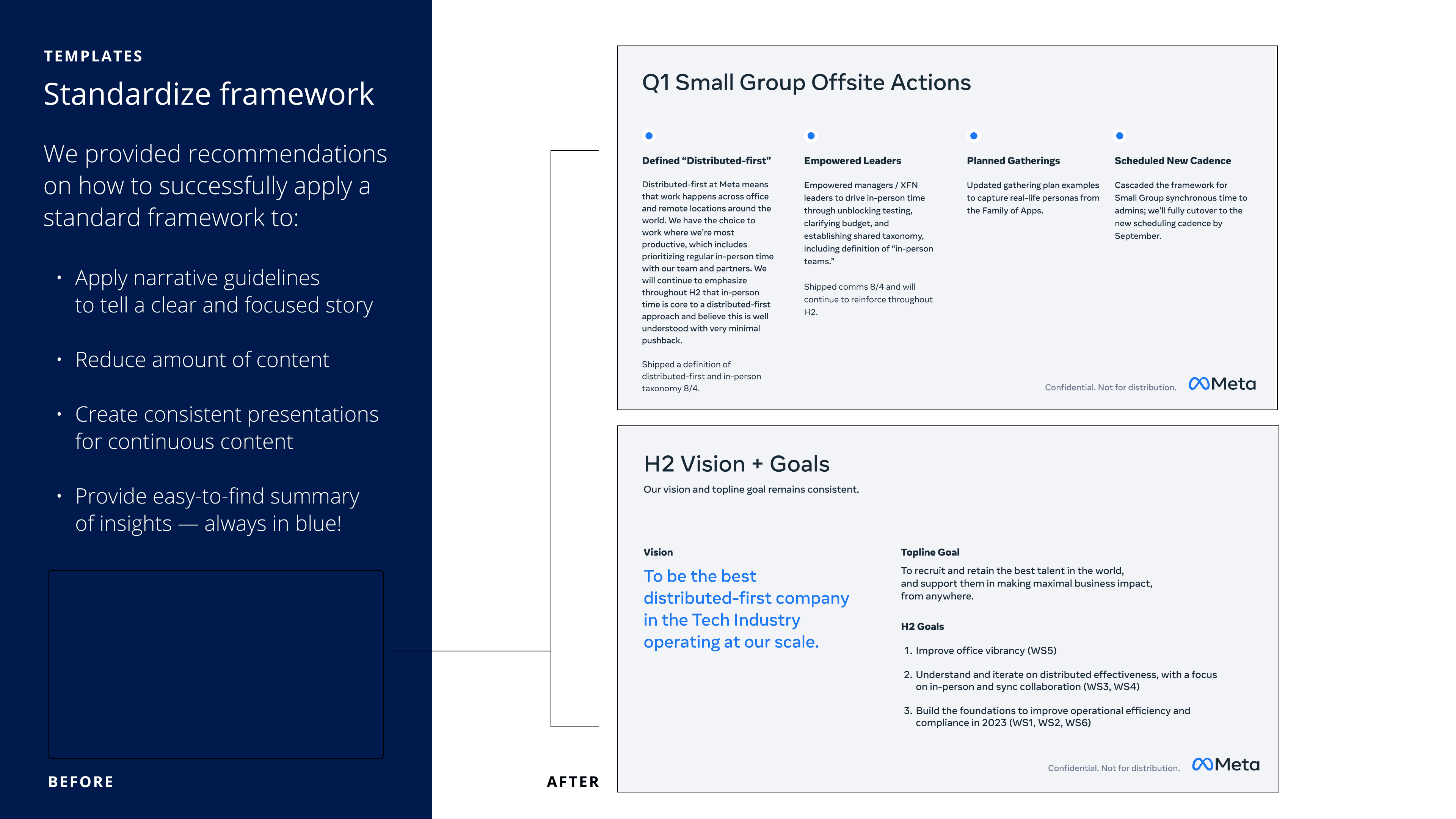
In addition to providing Meta with a comprehensive framework and Google Slide templates, we offered specific recommendations for storytelling and design tailored to individual slides. For instance, we tackled the challenge of dense content on one particular slide by implementing several strategies.
Firstly, we reduced the amount of content per slide to avoid overwhelming the audience. Next, we organized the content into distinct sections, distinguishing between past actions and future goals for clarity. We also leveraged typographic hierarchy to enhance readability, making key points more prominent and easily digestible. Lastly, we strategically incorporated the Meta logo to reinforce the context of the content and its source.
By applying these recommendations, we significantly improved the narrative flow and visual appeal of the slide, enabling Meta to convey their message more effectively. It's gratifying to learn from our recent call with them that they have already begun implementing these templates, demonstrating the immediate impact of our collaboration.
When we sat down with the client, we discovered our scope was much different than we anticipated.
It wasn’t a complex dashboard or a living system with data viz - it was a powerpoint.
Meta had a quarterly report that everything about the remote workplace like employee sentiment, office utilization, and their workplace composition.
The slide deck was massive, about 60 slides of very detailed data visualization.
Understanding the Deck
Lots of Questions
when showing this deck to leadership, there were complaints about the messaging and Issues.
What were they trying to say with this deck?
No Proper Requirements
What were the main takeaways?
What was the story?
Solution:
Simplify the Story:
The first step was to help the team focus on telling one clear story. Instead of showing all the data, we recommended focusing on the key insights that were most important to Meta’s goals.
By highlighting the main takeaways, the audience would be able to follow the presentation more easily.
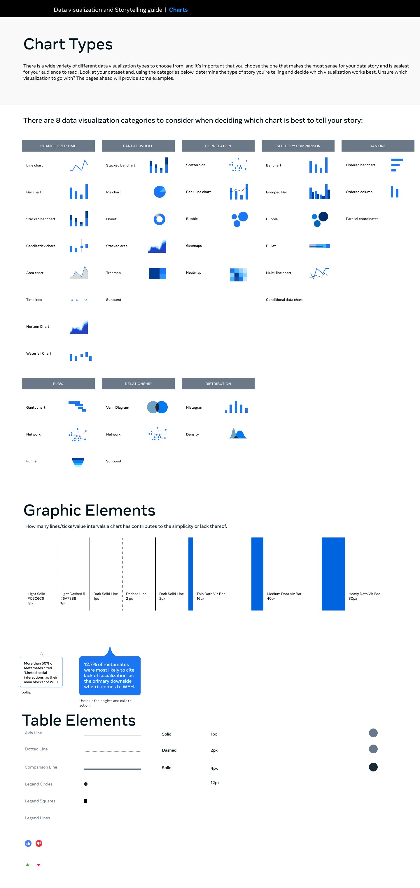
Better Data Visuals:
We suggested using simpler, more appropriate charts and graphs to match the data. This would help communicate the story more effectively without unnecessary details.
By using things like color coding and organizing the visuals better, the audience could understand the information at a glance.
Consistent Design:
We recommended creating a consistent design with better colors and typography that matched Meta’s brand. This would make the presentation look cleaner and easier to read.
Having consistent design elements across all slides would help the audience focus on the key points instead of getting distracted.
Reduce Overload:
To reduce information overload, we suggested simplifying the slides by focusing on one idea at a time. Using more whitespace and cutting down on clutter would make the presentation more engaging.
Limiting how much data was shown at once would help guide the audience’s attention and make it easier to understand.
Results:
By addressing these issues, The presentation much clearer and easier to follow:
Clarity: The story would become more focused, with fewer distractions, so the audience could easily grasp the main points.
Visual Communication: Simpler and more relevant visuals would help the audience quickly understand the key takeaways.
Engagement: A cleaner design and less cluttered slides would make the presentation more enjoyable and memorable for the audience.
Detailed Document Link
Storytelling Framework
We took a big-picture approach to Meta’s quarterly "Understand" deck and came up with a simple framework with 5 main slide types and sections. The goal was to make sure each slide had a clear purpose and message for the audience.
We focused on including:
A goal
Supporting information
An insight (always highlighted in blue)
Recommended next steps
We applied this framework to organize the deck more effectively, helping create a consistent flow throughout the presentation. This structure made it easier to follow and more efficient to put together each quarter.
As part of our hand-off, we also provided Google Slide templates. These templates made it easy to find and highlight key insights, with important points always in blue to make them stand out. This use of blue became a consistent theme in the rest of the presentation as well.