Enhancing Pitch App Usability
Nytro.ai is a top platform in Pitch Intelligence, focusing on training sales reps and getting them ready to sell. It uses advanced technology to analyze sales pitches and demos quickly, providing valuable insights for sales teams.
" The main goal was to make the system easier to use and create content quickly, improving customer satisfaction and engagement."

Headquarters
Palo Alto, California, US
Founded
2019
Industry
Sales Enablement
Revenue
$1.5 million (early 2022)
Company size
20+
Customers
8
Challenge
The app had a confusing layout, making it hard for users to find important features. Authors had trouble creating content, which made it harder for new users to learn. Also, the app didn't let users customize things or give them reports, making it less fun and easy to use.
Results
The updated app has a simple, organized look that makes it much easier for users to find what they need. We also improved the content creation process, reducing the time it takes to make pitches by 31%. Adding reporting and customization features has made users more engaged, resulting in a 26% increase in customer satisfaction.
31%
Reduction in pitch creation time
26%
Increase in CSAT Score
84%
Increase in Customer Engagement
Process: Design by Hypothesis
Analysis: The Customer Success team gathered feedback from customers to understand their challenges and find effective solutions.
Information Architecture: Using this feedback, I redesigned the app's layout and content to prioritise user needs.
Wireframing & Prototyping: I created simple sketches to plan the new design, refining them based on user feedback. Then, I made a detailed model of the design to test it thoroughly.
Usability Testing: I tested the design with my team, the customer success team, and various users to improve it further based on their feedback.
Visual Design & Style Guide: I developed a consistent look for the app, including colors, fonts, and icons, to keep the design unified. Additionally, I made a guide to maintain this consistency in future updates.
Before and After Experience
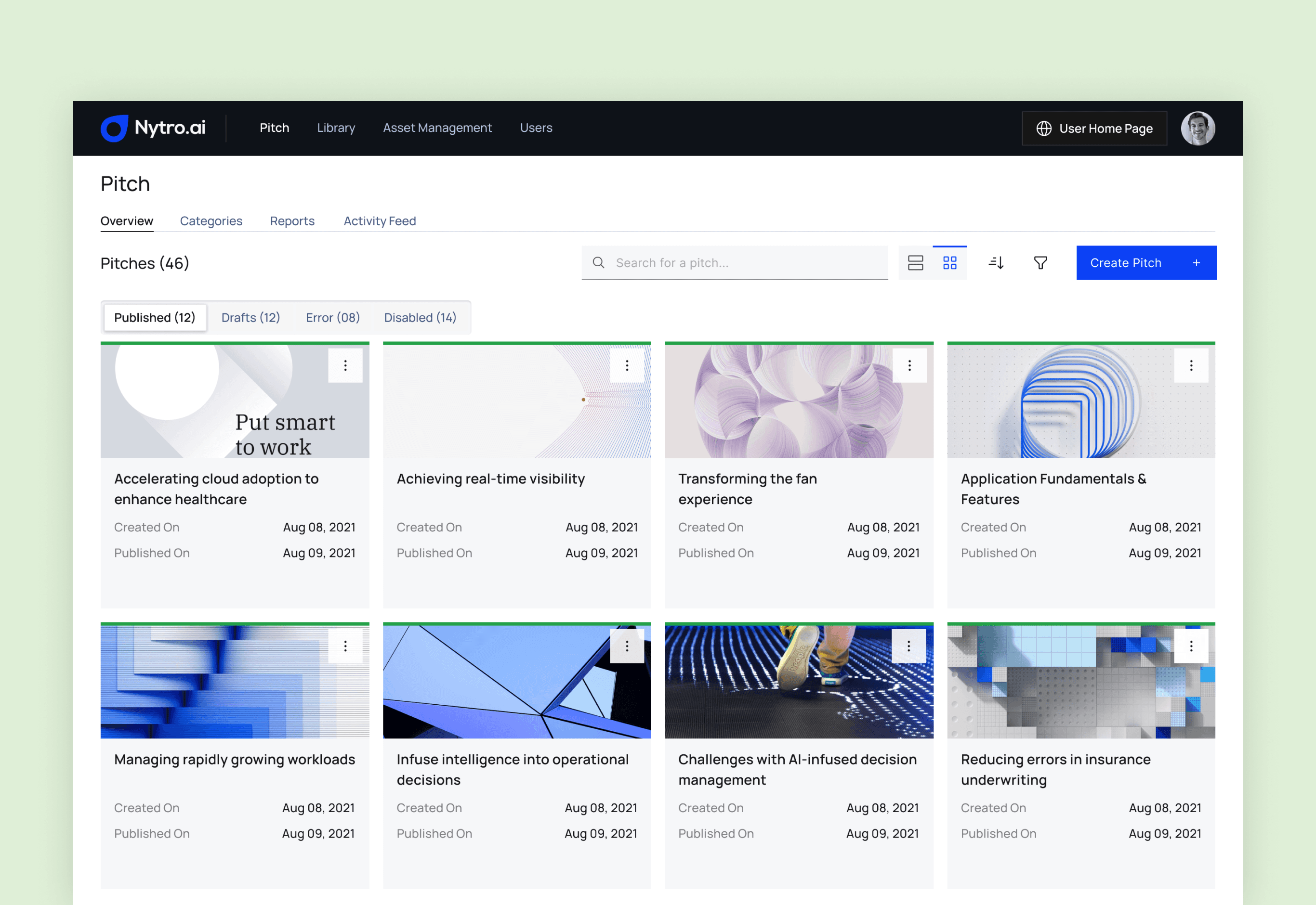
Pitch Overview

- Inconsistencies observed in actions/buttons, such as the Plus button and the button adjacent to the search field.
- Cards lack a structured presentation of information.
- Inconsistency identified in pitch thumbnails within cards.
- Question raised on the necessity to display both "Created date" and "Published date"; suggested retention if deemed necessary.
- Visibility issue noted with the kebab menu (three dots) when a thumbnail image is present; requires improvement for clarity.
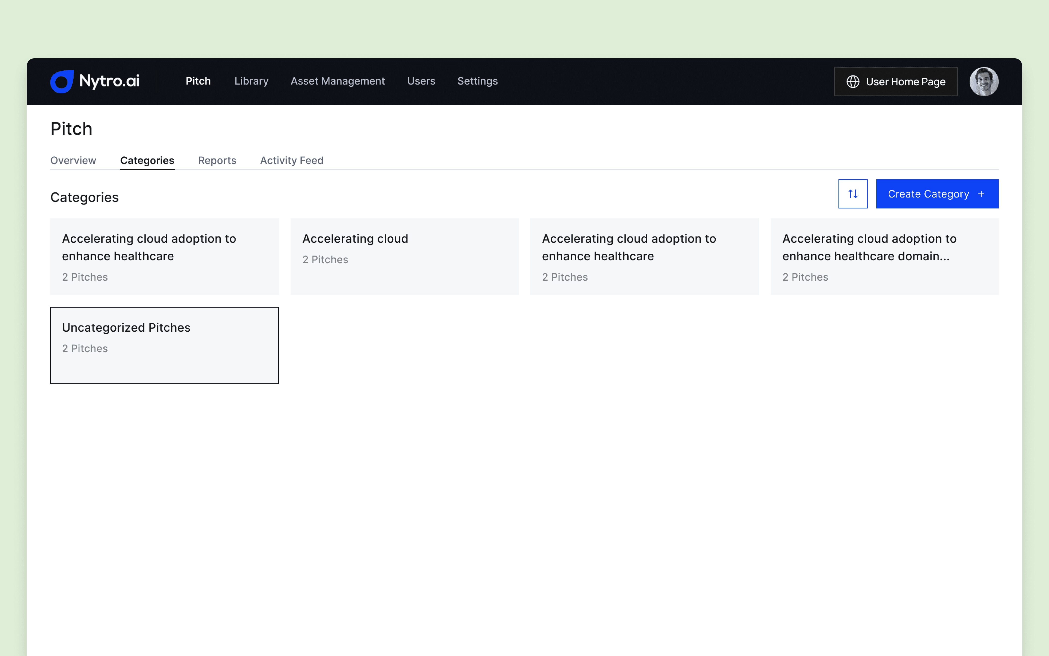
Pitch Categories

- The selected main navigational item, specifically "Categories," lacks contrast compared to other navigation items.
- The category listings page is deemed not visually appealing.
- Suggested improvement includes enhancing categories by displaying pitch statuses count, providing information on how many are published, drafted, etc.
Pitch Reports
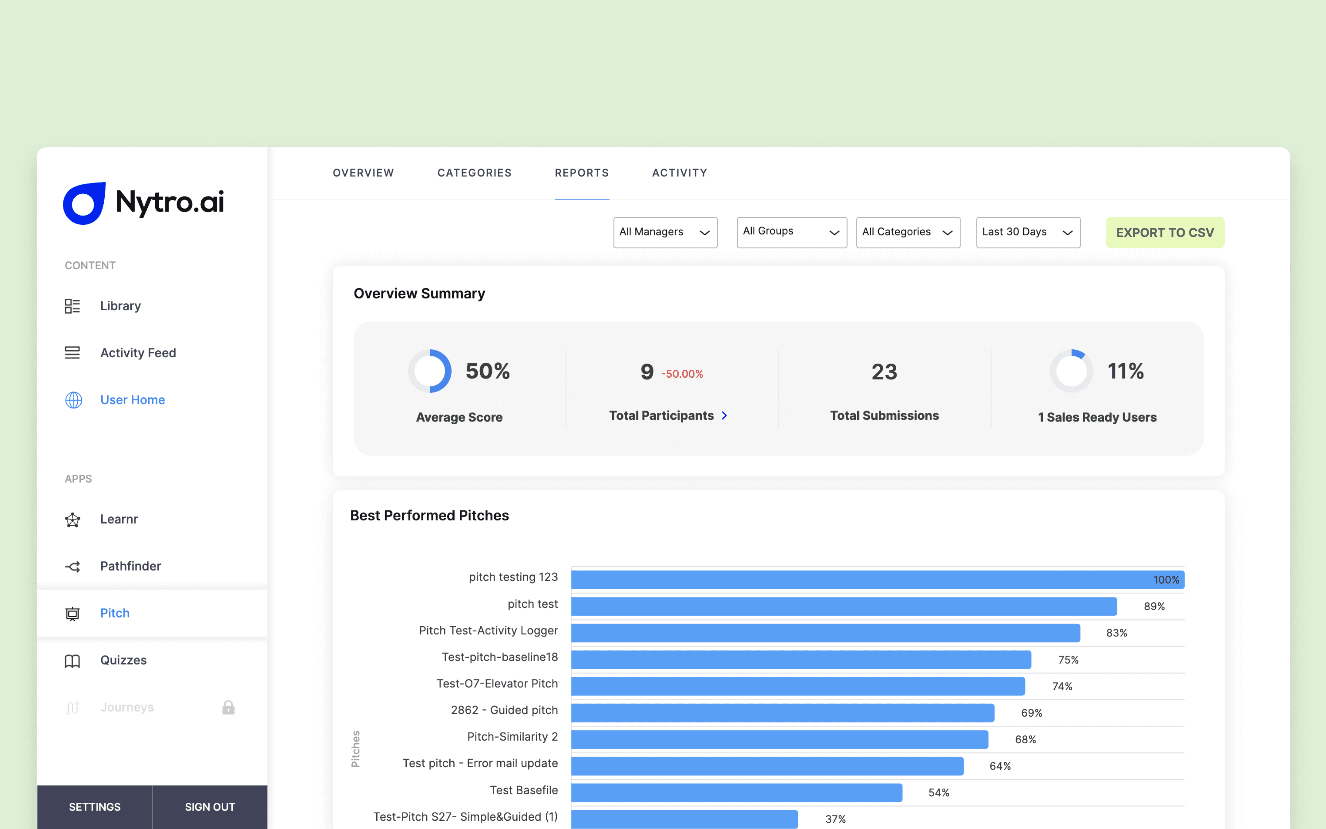
Individual Pitch Report
- Noted issues with a cluttered page.
- Identified inconsistencies in actions/buttons.
- KPIs and graphs deviate from the established design guidelines used elsewhere on the site.
Overall Pitch
- Inconsistent actions/buttons observed.
- KPI names lack clarity in conveying information about the respective KPIs.
Individual Report - User Submission
- Sections cards lack an informative interface.
- The presentation appears empty initially, with the sudden appearance of 53% in the right corner, indicating detached content elements.

"With our fresh visual branding and refined language, the pitch app distinctly encapsulates the essence of both our current and target customer base, as well as our core values."

Ravish Kamath
Founder & CEO | Nytro.ai
Conclusion
The redesign of the Nytro Pitch App successfully addressed usability concerns, leading to a more intuitive and user-friendly experience. The improved UX/UI design boosted user adoption, engagement, and satisfaction. This highlights the importance of well-designed templates for UX designers in delivering meaningful benefits.